Oyabro
Well-Known Member
- First Name
- Oury
- Joined
- Dec 25, 2023
- Threads
- 15
- Messages
- 182
- Reaction score
- 231
- Location
- Austin, TX
- Vehicles
- 2024 R1S, El Cap, Forest Edge, 20's (SOLD)
- Occupation
- Fixing technical things for simple folk
- Thread starter
- #1
Rivian’s aspiration to control the entire user experience through all software components of the infotainment system is understandable. This is fundamental to their business model, as they prioritize owning every step of the design process. For future iterations, I would welcome the introduction of more user options to enable widget customization. If the intention is to reduce the number of menus for a driver or passenger to navigate, this would be a valuable quality-of-life enhancement to the ownership experience. This concept is akin to the preset options introduced into the climate menu, which saves vent positions.
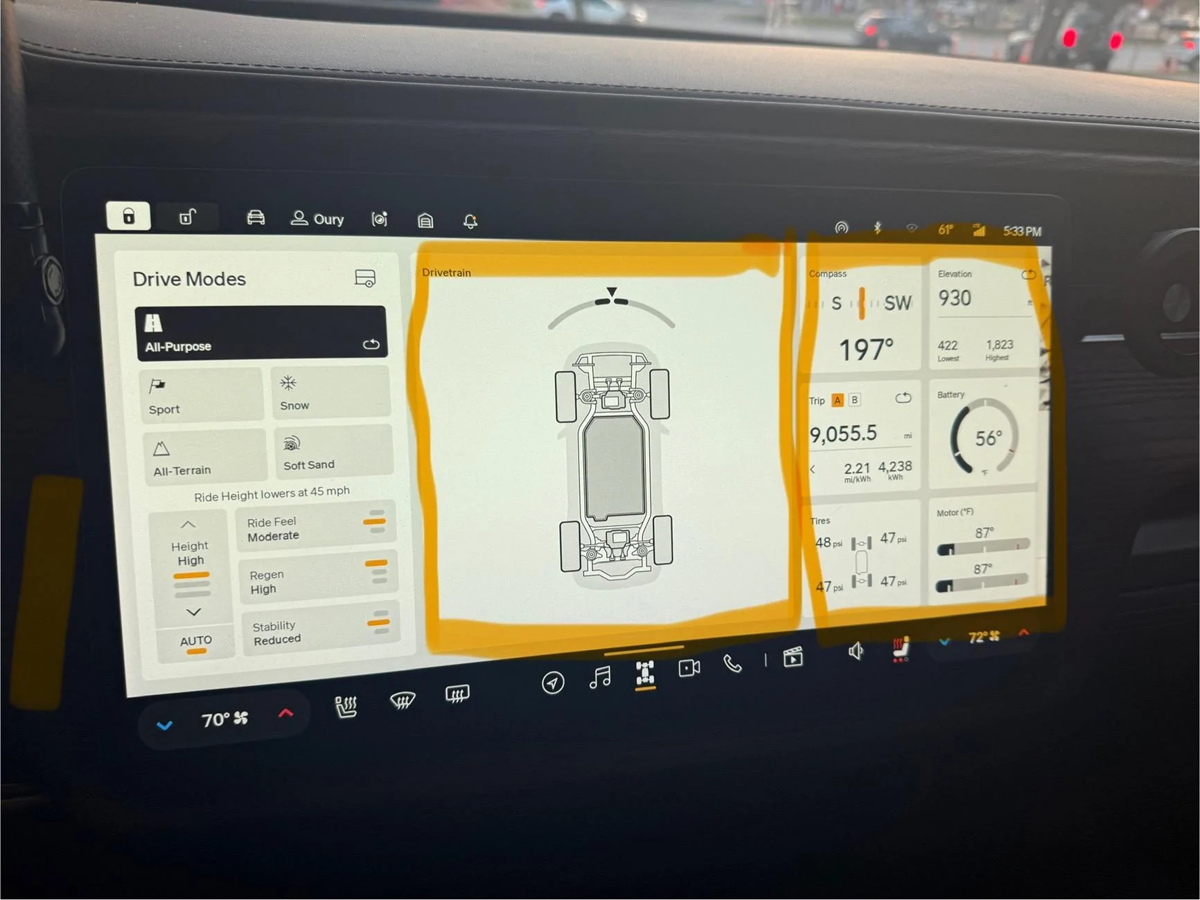
The Drive Modes menu is structured into three distinct columns. The first column presents drive modes and preset adjustments, the second column displays a dynamic vehicle overlay that occupies over a third of the screen, and the third column contains various vehicle data points, including tire pressure, battery temperature, and motor temperature.
It would be wonderful to maximize this screen by enabling the driver to customize the displayed content. Personally, I would prefer to remove the vehicle from the middle and replace it with a map or divide the screen in half to share the space. This applies to all widgets, as previously mentioned. Considering ergonomics, it would be beneficial to implement a feature that allows the driver to hold down on the screen for a few seconds to make the widgets editable. This would provide the freedom to select the desired content and store up to three saved options in a stack.
Here is an example image I took from my vehicle. I maybe out in left field here but when I am in my vehicle it comes up frequently where I’d love to be able to do most of my tasks on one screen.
Sponsored