hevak
Active Member
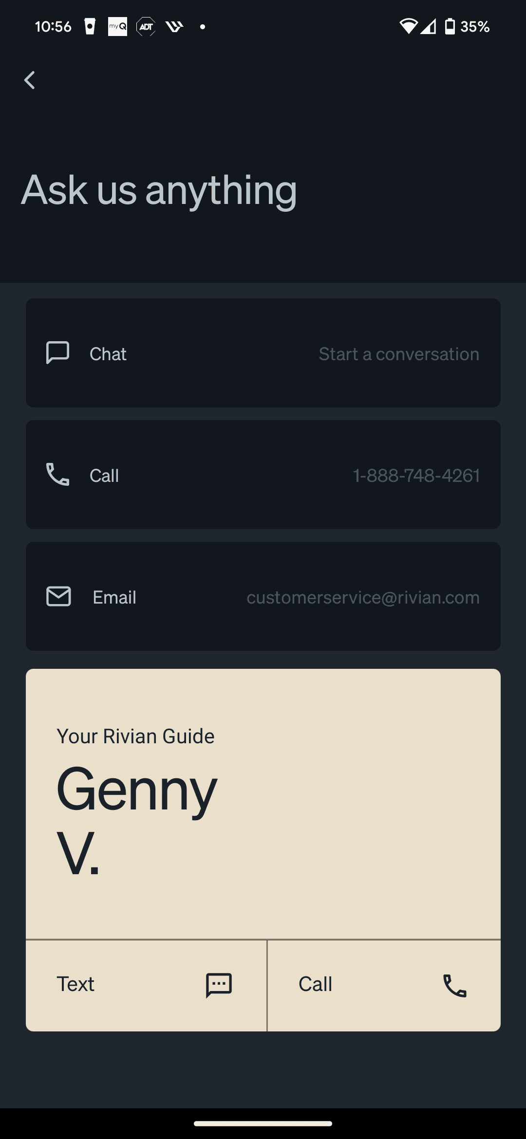
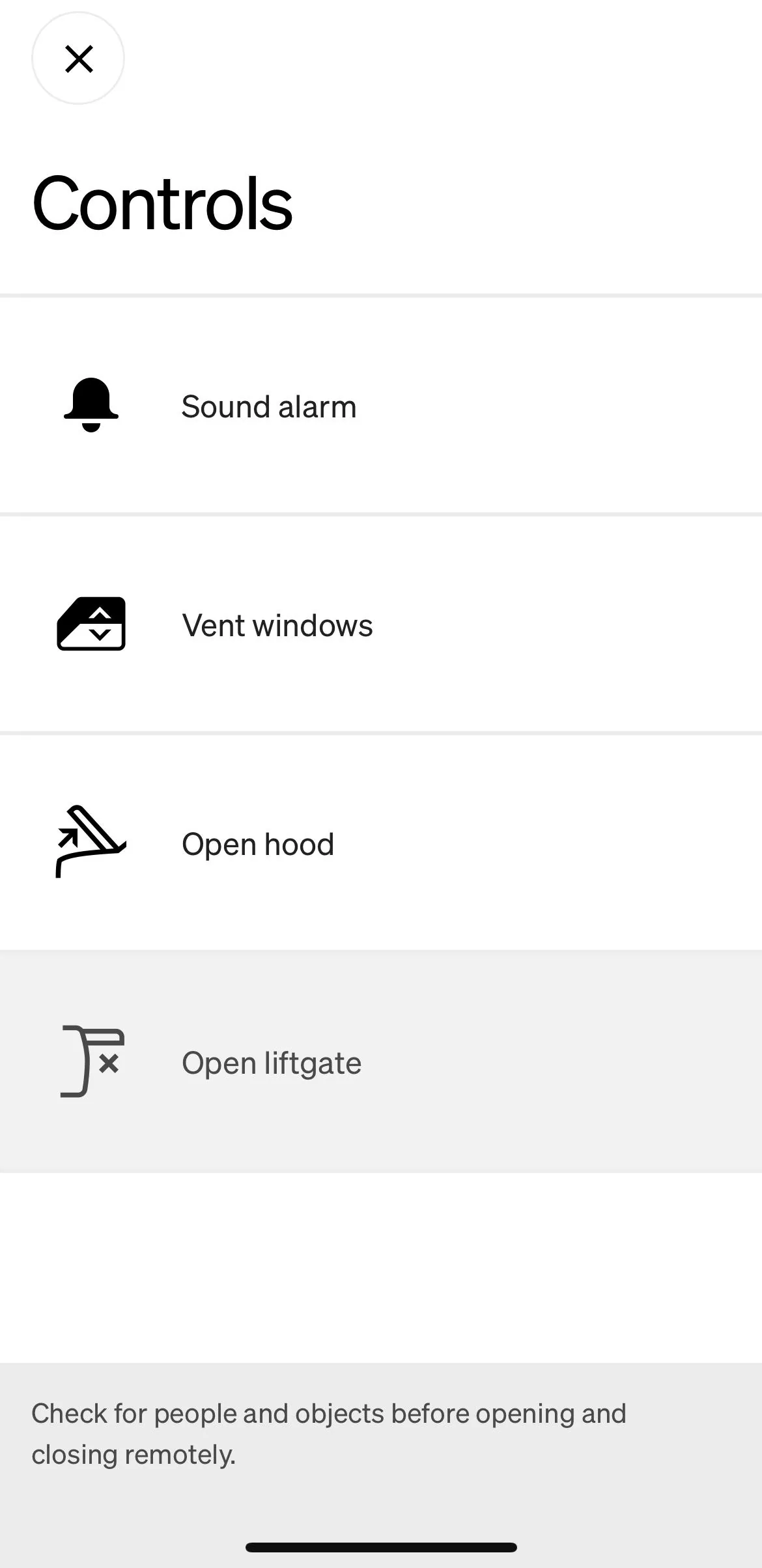
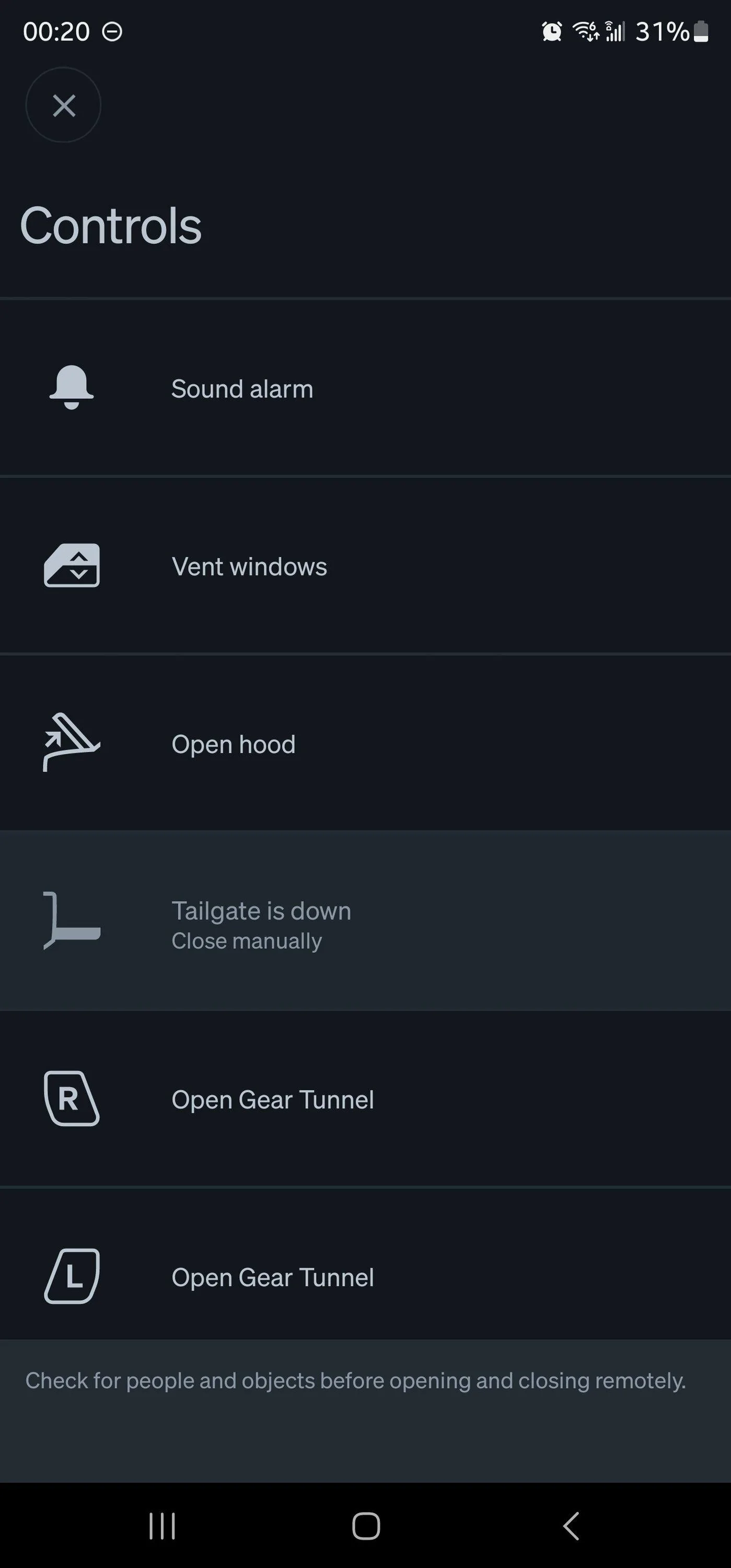
While this is an improvement from what it was, why is there still so much wasted space and why is everything still so big? It forces you to have to scroll and tap to see information. Why can’t it display information about your car in a clear and concise way.
it’s so big, it doesn’t at all match the fonts and sizes of the rest of the OS.
it’s so big, it doesn’t at all match the fonts and sizes of the rest of the OS.
Sponsored