Sponsored

Energy pie chart decoded

BillArnett

Well-Known Member
First Name
Bill
Joined
Nov 23, 2019
Threads
11
Messages
186
Reaction score
352
Location
Emerald Hills CA
Vehicles
Rivian R1S Quad Max, 20" AT
Occupation
Retired
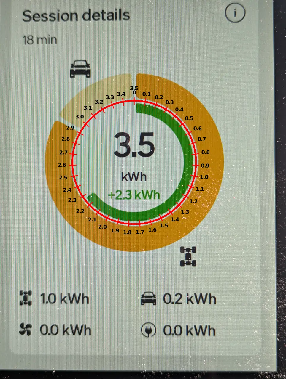
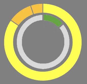
I think I've finally understood what the donut chart on the right hand side of the energy monitor screen means. Here's an example:
Rivian R1T R1S Energy pie chart decoded zzz

Let the numbers shown below the donuts be denoted:
W = net wheels (this is net of used - regen)
S = systems
H = HVAC
O = outlets
and the numbers inside the donuts:
R = regen (green)
B = W + S + H + O + R (big white number)

The outer donut represents the NET energy used and what fraction goes to driving, system, HVAC and outlets; 100% = W + S + H + O
and this net energy is what is used as the denominator of the efficiency calculation in the middle pane
The inner donut represents the total energy used and what fraction of that came from regen; 100% = B (the big white number)
the remaining part of the inner donut is B - R = W + S + H + O, the net energy from the battery (same as outer 100%)
It would be a lot clearer if the sum W + S + H + O was displayed somewhere; it’s lots more useful than B (the big white number)
Note that the outer donut is an expansion of the empty arc of the inner donut.

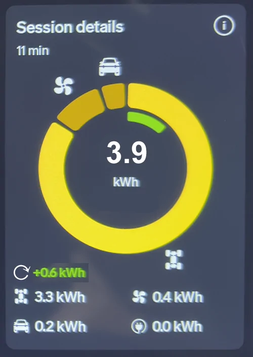
I would rather see it displayed something more like this:
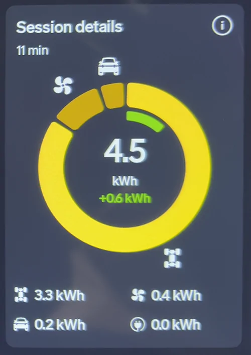
Rivian R1T R1S Energy pie chart decoded qqqq
Sponsored


usulio

Well-Known Member
Joined
Jun 2, 2023
Threads
8
Messages
1,031
Reaction score
1,249
Location
CO
Vehicles
R1S
Clubs
 
Agree. It's funny the net amount of power used (change in battery level) is not displayed anywhere.
 

VSG

Well-Known Member
Joined
Oct 3, 2022
Threads
4
Messages
3,202
Reaction score
5,985
Location
WA
Vehicles
R1T LE/RB/OC/20
Close, but not exactly.
  • The Yellow circle (Gary calls it "flesh color") is gross energy taken from the battery.
  • The green partial circle is gross energy put back into the battery, on the same scale.
Keeping them on the same scale is key, because it visually communicates proportion. From your first image, the green arc looks to be about 1/8 of the way around the circle, so about 1/8 (12.5%) of your total gross usage gets returned to the battery by regen. (Actually, if you do the math, it's 0.6/4.5 = 0.1333 = 13.3%). So a quick glance is enough to give you a great estimate.

The big white number in the center of the circle is the gross energy taken from the battery.

The difference between the yellow and the green is the net energy usage. While there is no big white number showing the net, the net energy usage has always been available and shown elsewhere. There has never been a way to see the gross before.

The white numbers at the bottom are net numbers broken down into the four energy consumption categories that are being tracked. Those numerical values are less interesting to me than their relative proportions, which is visually evident from the diagram.

The point of this diagram is to show you information you can't get elsewhere. Before this existed, all you could see was the net energy usage - this diagram not only shows the gross values (expended and generated) but also breaks the gross usage down into components and shows you comparatively how much you're getting back in relation to how much you're expending.

Two things I've noticed from watching this are:
  1. I get a lot more back in regen than I thought I was getting. It's fun to see regen exceed gross usage.
  2. The HVAC takes a lot less energy than people imply.
 
OP
OP
BillArnett

BillArnett

Well-Known Member
First Name
Bill
Joined
Nov 23, 2019
Threads
11
Messages
186
Reaction score
352
Location
Emerald Hills CA
Vehicles
Rivian R1S Quad Max, 20" AT
Occupation
Retired
Close, but not exactly :) .

Here's a mini Excel sheet with the numbers from my example above (I omitted the zero for outlets):
Rivian R1T R1S Energy pie chart decoded s3


Pasting the two donuts together perfectly reproduces Rivian's version above:
Rivian R1T R1S Energy pie chart decoded 1754595154659-47


As you can see the outer donut ("yellow circle") does NOT include the energy taken from the battery that was replaced by regen, it's just the sum of the three NET uses. But the inner donut does represent the gross: the green portion is the amount replaced by regen and the gray portion (in my diagram, the empty part in Rivian's) is the net taken from the battery (same as outer donut). It's that gray part that is used to compute the efficiency in the middle pane.

I don't see much value in the gross number. It's not clear what it means physically (the systems may run from the regen-ed power without going in and out of the battery). The net number is what I would like to see displayed more prominently. (It is shown in the trip computer but sometimes from a different interval.)

It is good to see the relative contribution of regen. But it looks really funny if your net for the session is negative (eg, if you started at the top of a hill and looked at it at the bottom):
Rivian R1T R1S Energy pie chart decoded 1754596901184-wi
 

VSG

Well-Known Member
Joined
Oct 3, 2022
Threads
4
Messages
3,202
Reaction score
5,985
Location
WA
Vehicles
R1T LE/RB/OC/20
Close, but not exactly :) .
Touché.

Let me explain why I'm right (🙂
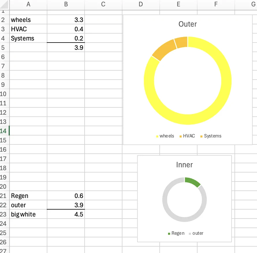
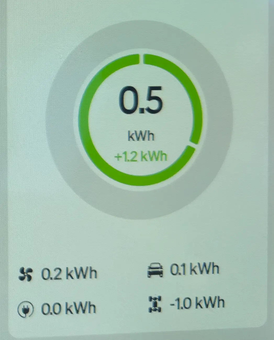
) with a picture of my own, where I've added a scale on top of my recent drive:
Rivian R1T R1S Energy pie chart decoded image63


To summarize, we both agree on almost everything, but you say that the yellow/orange circle shows the NET power usage, and I say it shows the GROSS power usage.

We agree that the big black number is total GROSS usage.
We agree that the green number in the circle is GROSS regen.
We agree that the four numbers at the bottom show NET usage for the four subsystems.

We also agree the green arc shows regen, but relative to what? The way I see it the full scale (0 - 360 degrees) goes from 0 to the GROSS energy usage. Zero to 3.5 in this case. Then the green arc makes sense - in this picture, it's about 2/3 of the way around the circle because 2.3kWh is about 2/3 of 3.5kWh. So to me, that establishes the scale.

If this big black number were to be changed to the NET number, as you suggest it should be, then it would be confusing in this case, right? The big black number would be 1.2, whicle the little green number would be 2.3, and the green arc would be 2/3 of the circle still, but what would the scale on that circle be?

And if the scale used for the green circle is not the same as the scale used for the yellow/orange circle, then why are these two circles shown on top of each other in the same graph?

In your interpretation, the yellow/orange circle actually goes from 0 - 1.2 kWh, because in this case the net usage (the sum of the four subsystems) is only 1.2 kWh. I don't see how using NET here conveys any information - just the opposite, because the green arc is shorter than the yellow/orange arc, it seems like you're saying the NET usage is much bigger than the power added back by regen. It's not - in this case the regen power is almost twice the NET usage.

Additionally, the big black number 3.5 in my image is clearly a label, just like the smaller green 2.3 is clearly a label. If the green label is obviously labeling the regen power, why isn't the 3.5 obviously labeling the yellow/orange circle? And since 3.5 kWh is the GROSS power, then that means the yellow/orange circle is the GROSS power. If you don't think the big black 3.5 is a label, then why is it shown in the middle of this circle? Same argument if 3.5 kWh is not a label but a scale. Regardless, if it's a number not related to this image then it wouldn't be there.

Here's a mini Excel sheet with the numbers from my example above (I omitted the zero for outlets):
When looking at your spreadsheet, if you graph the GROSS numbers instead of the NET numbers for the four subsystems in yellow/orange you will see there's actually no difference in the way that yellow/orange circle looks - that's because the relative usages (the size of the pie slices) of the four subsystems is the same whether you compare net or gross. The net numbers for the four subsystems is shown at the bottom. To get the gross numbers for each subsystem you just multiply by gross/net, which in this case is 3.5/1.2. So in my image the gross drivetrain usage is 1.0 * 3.5 / 2.3 ~= 2.92, and the gross systems usage is 0.2 * 3.5. / 2.3 ~= 0.58. Looking at the yellow/orange circle, you will see that the two slices are ~2.92 and ~0.58.

Because there's actually no difference in the way that yellow/orange circle looks when you use GROSS vs NET, it's tempting to say it doesn't matter whether it's interpreted as gross or net, but I think it does. As I said in my post above, "Keeping them on the same scale is key, because it visually communicates proportion." That's why I'm convinced it has to be gross. If it's net, then there's no valid comparison between the subsystem usages and the regenerated power - that only makes sense if the scale is the same. That comparison of how much you get back through regen vs how much gross power you expend in each of the subsystems is to me the MOST important take-away from this graph. And that comparison only works if they're on the same scale and the yellow/orange circle shows GROSS power.

Also note that NET POWER is a fiction - it's a derived number calculated after the fact. The drivetrain uses power. Gross power, not net power. The HVAC uses gross power, etc. Their usage is not changed in anyway by the regen, they will use the same amount of power whether or not you are generating any power through regenerative braking. A power meter attached to the HVAC power input is going to read gross power.

Net power is really just a virtual construct, determined by subtracting the generated power from the actual used power. But that actual used power is actually used in all cases.

I see the whole purpose of this display as giving us numbers that we didn't have access to before, broken out into more fine-grained detail. Not necessary to know, but interesting and perhaps elucidating. Prior to this display, all we could see was total net power usage. Now we get details as to where that power is going, how much we are actually using (gross) and who much we are actually getting back from regen (gross). These are the numbers that, when combined, make up the derived net power value that we've always been able to view.
 
Last edited:

Sponsored

OP
OP
BillArnett

BillArnett

Well-Known Member
First Name
Bill
Joined
Nov 23, 2019
Threads
11
Messages
186
Reaction score
352
Location
Emerald Hills CA
Vehicles
Rivian R1S Quad Max, 20" AT
Occupation
Retired
We’re getting close to an understanding. (That it takes so much work to figure this out is a pretty serious indictment of the design!)

The way I see it is that the two donut charts are showing two different things, on two different scales, and it’s a big mistake to make them concentric. That’s just confusing.

I think we agree about the inner one. It’s clearly showing the fraction of regen compared to the gross power used. But that’s not an appropriate thing to show with a donut chart since the regen number can be greater than the total and you get the mess in my previous post.

We also agree that the sectors of outer donut represent the 4 usages below. But one of those, the wheels, is a NET number (and so are the others, obviously). So it seems natural to interpret the whole of the donut as a net quantity. But as you say, it doesn’t really matter to the look of the chart since the relative size of the sectors doesn’t depend on scale. But this chart will also fail badly if the wheels number is negative.

The comparison between regen and the gross energy that you’re looking for is simply the inner donut. But you can’t compare the size of the regen arc with the size of the outer usage arcs, they’re not on the same scale. In your example the regen arc is smaller than the wheels arc when in fact the regen number is larger.

It’s just a bad idea to use a donut (or pie) chart for quantities that can be negative. Much better to use stacked bar charts.
 

SoCal Rob

Well-Known Member
First Name
Rob
Joined
Apr 19, 2021
Threads
39
Messages
2,808
Reaction score
5,963
Location
Laguna Niguel / Palm Springs / Pioneertown
Vehicles
2025 Rivian R1S & 2021 VW ID.4 (2023 R1S sold)
Occupation
Information Technology
Clubs
 

VSG

Well-Known Member
Joined
Oct 3, 2022
Threads
4
Messages
3,202
Reaction score
5,985
Location
WA
Vehicles
R1T LE/RB/OC/20
That it takes so much work to figure this out is a pretty serious indictment of the design!
Yeah, I think if they just added a few words to the display here and there - maybe an explicit "net" when they mean net - it would be a lot more useful. At the very least, if you click on the circle-i icon it should explicitly tell you whether it's gross or net.
It’s just a bad idea to use a donut (or pie) chart for quantities that can be negative. Much better to use stacked bar charts.
Yes, pie charts only work for positive numbers, which is one other reason I think it's intended to show gross numbers, which are always positive. But also, there's clearly a bug in the software where it doesn't show the right things when the net usage is negative (not only the pie chart, but the "net" numbers themselves at the bottom seem wrong). What I expect to see in the pie chart for that case is the green arc goes from 0-360 and sets the scale (0-1.2kWh in your example from #4), while the yellow/orange ring only goes part way around the circle (0.5kWh, in your example from #4, would be slightly less than half the circle on the same scale.) That would continue to display the relative amounts of usage/consumption and the fact that generated power is greater than consumed power.
 

1stPlace

Well-Known Member
Joined
Oct 9, 2023
Threads
9
Messages
257
Reaction score
462
Location
SE MI
Vehicles
Rivian R1S
Clubs
 
It is so wild to me how much discussion/analysis is needed to decode the energy infographics. I thought Rivian advertised this as a way for people new to EVs to get a better understanding. I've had my Rivian for over 2 years now and can't fully understand enough of these infographics to utilize them.

Net energy is more useful and actionable information than gross energy. Energy graphs should chart Net energy, not gross + regen on the -y axis. Also, the x axis should probably be distance if you are going to be eyeballing integrals or guessing anything actionable on efficiency. Pie charts or whatever they want to call that circle graphic on the right are just fancy colors around one number, and that should be net energy, if it isn't already. Truthfully, I don't care because I am comfortable and secure in my range ability, and I value performance over efficiency. I do quite like numbers and math in applied science, but these graphics feel like decorations to make people feel/look smart and are otherwise utterly useless.
 

azbill

Well-Known Member
First Name
Bill
Joined
Jun 8, 2020
Threads
17
Messages
1,695
Reaction score
1,976
Location
Arizona
Vehicles
Escalade IQ, Mach E, Hummer EV SUT
Occupation
Retired
It is so wild to me how much discussion/analysis is needed to decode the energy infographics. I thought Rivian advertised this as a way for people new to EVs to get a better understanding. I've had my Rivian for over 2 years now and can't fully understand enough of these infographics to utilize them.
Exactly. It took Rivian a few years to add this, when all my other EVs have had this since the beginning, but with a much simpler and more understandable display. They simply provide the total energy used from the battery, then an amount (with percentage) for the driving, HVAC, accessories and preconditioning.
Sponsored


Top