Sponsored
brancky3
Well-Known Member
- First Name
- Brandon
- Joined
- Feb 11, 2022
- Threads
- 7
- Messages
- 727
- Reaction score
- 858
- Location
- Greenville, SC
- Vehicles
- 22 CY R1T, 21 MachE GT
- Occupation
- IT
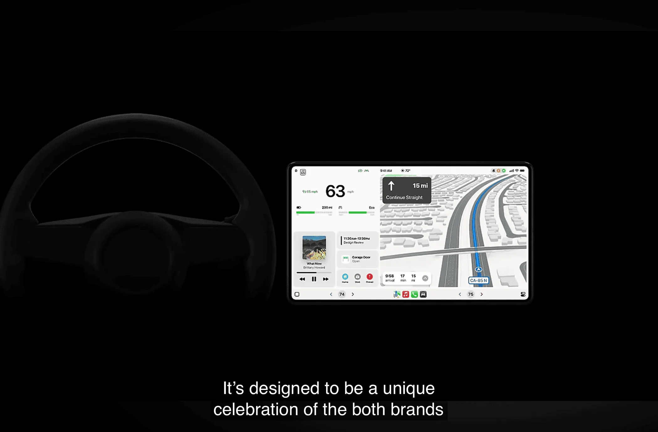
That UI would look a LOT better if the maps used satellite images. It looks way too bland and monotone IMO and has a ton of wasted space.Just saw your quoted thread lol. Looking at that UI though ??
rehan
Member
- Thread starter
- #5
I’m thinking we could change that setting to use satellite images on the iPhone. It’s also good to have a balance between other controls and maps in one screen. It would be one less tap to skip the music and etc.That UI would look a LOT better if the maps used satellite images. It looks way too bland and monotone IMO and has a ton of wasted space.
Sponsored
racekarl
Well-Known Member
Routing direction UI while driving is the main reason I've switched to using Apple Maps over Google Maps. Apple Maps' less cluttered interface, larger routing instructions, and clearer travel route indicator make it much easier to follow in unfamiliar places, IMO. Eye candy and clutter may look cool in a screenshot but just get in the way when you need to quickly parse and assimilate information.That UI would look a LOT better if the maps used satellite images. It looks way too bland and monotone IMO and has a ton of wasted space.
Boo23
Active Member
”Quickly parse” what the English call safe overtaking.Routing direction UI while driving is the main reason I've switched to using Apple Maps over Google Maps. Apple Maps' less cluttered interface, larger routing instructions, and clearer travel route indicator make it much easier to follow in unfamiliar places, IMO. Eye candy and clutter may look cool in a screenshot but just get in the way when you need to quickly parse and assimilate information.
COdogman
Well-Known Member
My favorite thing Apple Maps does is the haptic buzz from my Apple Watch when I come up to a turn in the directions. I find I don’t have to look at the screen as often and I don’t need to have the audio prompts turned on either.Routing direction UI while driving is the main reason I've switched to using Apple Maps over Google Maps. Apple Maps' less cluttered interface, larger routing instructions, and clearer travel route indicator make it much easier to follow in unfamiliar places, IMO. Eye candy and clutter may look cool in a screenshot but just get in the way when you need to quickly parse and assimilate information.
racekarl
Well-Known Member
That went over my head, whatever it was supposed to be...”Quickly parse” what the English call safe overtaking.
SwampNut
Well-Known Member
The British often add an 'r' sound where it doesn't belong, like Bostonians do. So "wash" becomes "warsh" and "pass" becomes "parse." It's a play on words since both are actual words.That went over my head, whatever it was supposed to be...
Sponsored
racekarl
Well-Known Member
Nah, the Boston accent and Received Pronunciation are both "non rhotic" in that "r" is generally dropped before a word-ending consonant sound, not added. Someone from Boston would pronounce "parse" as "pass" (or really "pahse") but would not add an r into pass to make it sound like parse. (We do sometimes add a "linking r" to the end of a word like idea->idear, tuna->tunar)The British often add an 'r' sound where it doesn't belong, like Bostonians do. So "wash" becomes "warsh" and "pass" becomes "parse." It's a play on words since both are actual words.
That inserted r like wash->warsh sounds more like Appalachia. No proper Brahmin would be caught dead speaking like that
")
SwampNut
Well-Known Member
Dunno, it might be like the Asian L and R thing, where to them they think they say it, to us it sounds like they do BOTH add and drop them. My Boston friend draps it for things like car, and adds it for wash. In my ears.
Researchers for the Massachusetts Turnpike Authority found over 200 dead crows near greater Boston recently, and there was concern that they may have died from Avian Flu. A Bird Pathologist examined the remains of all the crows, and, to everyone's relief, confirmed the problem was definitely NOT Avian Flu. The cause of death appeared to be vehicular impacts.
However, during the detailed analysis it was noted that varying colors of paints appeared on the bird's beaks and claws. By analyzing these paint residues it was determined that 98% of the crows had been killed by impact with trucks, while only 2% were killed by an impact with a car.
MTA then hired an Ornithological Behaviorist to determine if there was a cause for the disproportionate percentages of truck kills versus car kills.
The Ornithological Behaviorist very quickly concluded the cause: when crows eat road kill, they always have a look-out crow in a nearby tree to warn of impending danger.
The scientific conclusion was that while all the lookout crows could say "Cah", none could say "Truck."
Boo23
Active Member
Just the English, not the British but good job avoiding being an arse with your reply ?The British often add an 'r' sound where it doesn't belong, like Bostonians do. So "wash" becomes "warsh" and "pass" becomes "parse." It's a play on words since both are actual words.
Glembi2
Well-Known Member
- First Name
- Chris
- Joined
- Dec 3, 2023
- Threads
- 1
- Messages
- 736
- Reaction score
- 818
- Location
- Vienna, Virginia
- Vehicles
- R1S, Genesis GV70, Civic
- Occupation
- Patent attorney
I applaud anyone who tries to learn English as a second language. I did not appreciate how whacked English is until I started studying Japanese.Dunno, it might be like the Asian L and R thing, where to them they think they say it, to us it sounds like they do BOTH add and drop them. …
And yes the switching of Rs and Ls, can be comical. I received a few requests for my “regal “ opinion.
Japanese does not use the L sound, English has distinct R and L sounds, and (to what I understand) Korean has the R and L sounds and a third R/L sound in between.
SoCal Rob
Well-Known Member
A ton of wasted space? It’s like Apple consulted Rivian.That UI would look a LOT better if the maps used satellite images. It looks way too bland and monotone IMO and has a ton of wasted space.

Sponsored
Similar threads
- Replies
- 15
- Views
- 1,872
- Replies
- 211
- Views
- 62,280
- Replies
- 39
- Views
- 10,154