OP
OP
SoCal Rob
Well-Known Member
- Thread starter
- #31
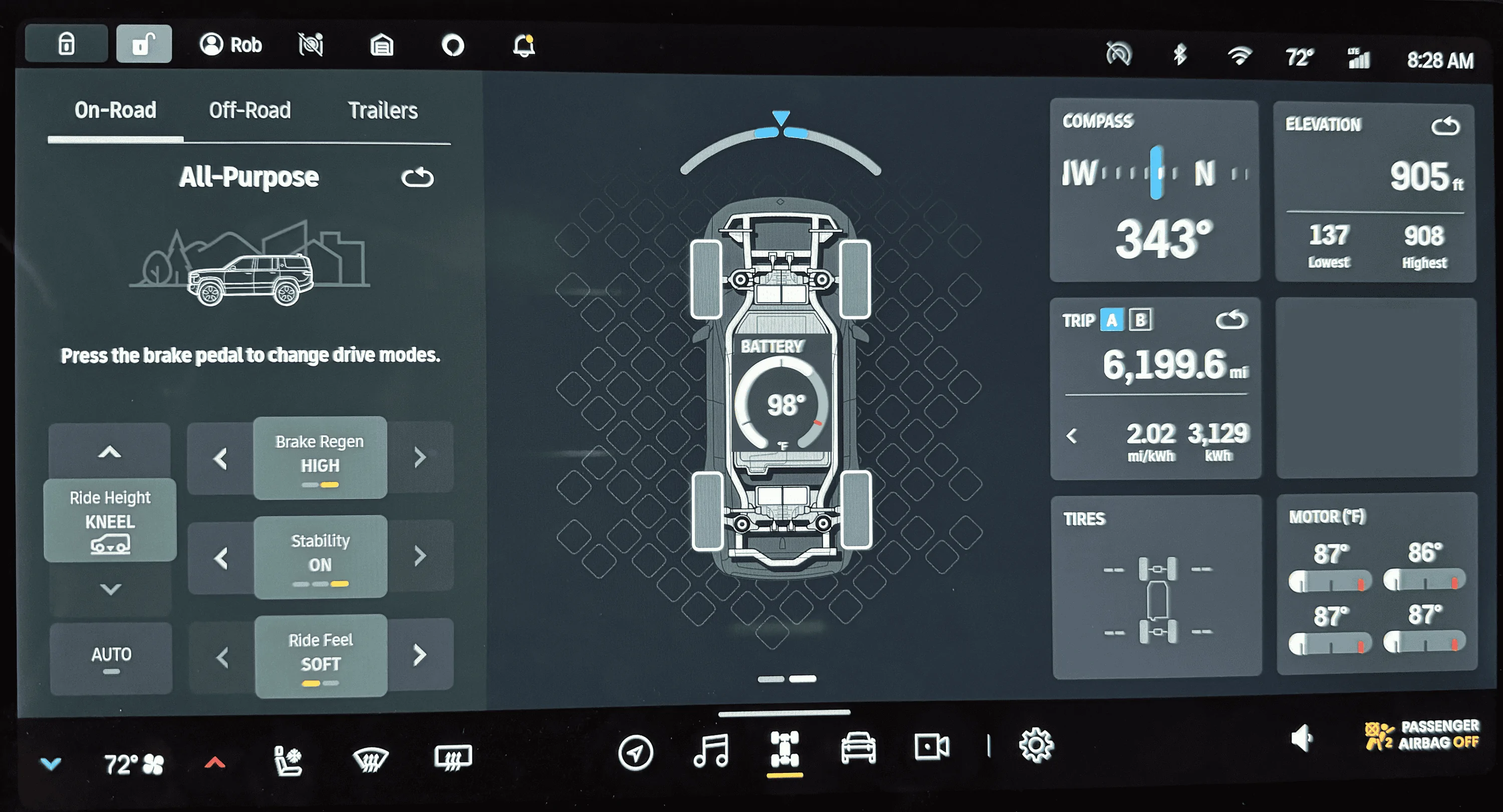
I know the gauge in the center could be too busy for some. I initially envisioned it with the battery graphic as a bar graph showing the temp range, this would be in keeping with the wheel graphics which are bar graphs showing power delivered or recovered. I’d probably make the battery temp bar graph show as blue (too cold), white (optimal temp range), or red (too hot). My skills with graphics just aren’t up to the task, but I can do a crude copy/paste/resize.I personally disagree with the UI suggestion (I ilke the clean infographic and the visual hierarchy of "schematic" versus "meters" as distinct interests). But christ dude, you don't have to be a dick about it. He made a constructive suggestion. It's enthusiasm, not entitlement.
I'll take overeager feedback over holier-than-thou cynicism any day of the week.
Sponsored