riv-evah
Member
- Thread starter
- #1
I've been extremely disappointed of the clarity of the map, and only of the map, when in night/dark mode. I'm seeing the serious issue on my 2025 R1S's center display and on my Android phone.
[ I had posted something similar this in the large 2025.22 thread, but believe it deserves its own thread, especially since this isn't 2025.22 specific ]
I like dark mode. I use it on Android phones, I use it on Windows computers, and I use it on my AAOS Volvo XC90. Backgrounds are black (or dark), text is light, and everything is crisp and readable, even in bright sunlight. Unfortunately, that's not been my experience with Rivian.
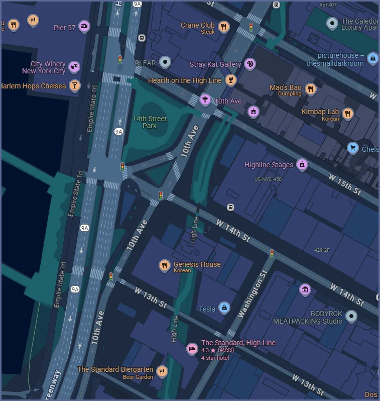
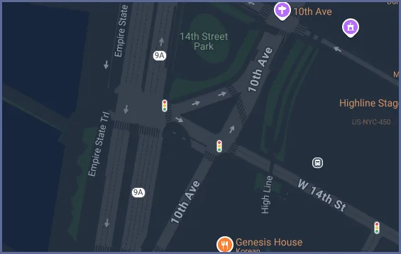
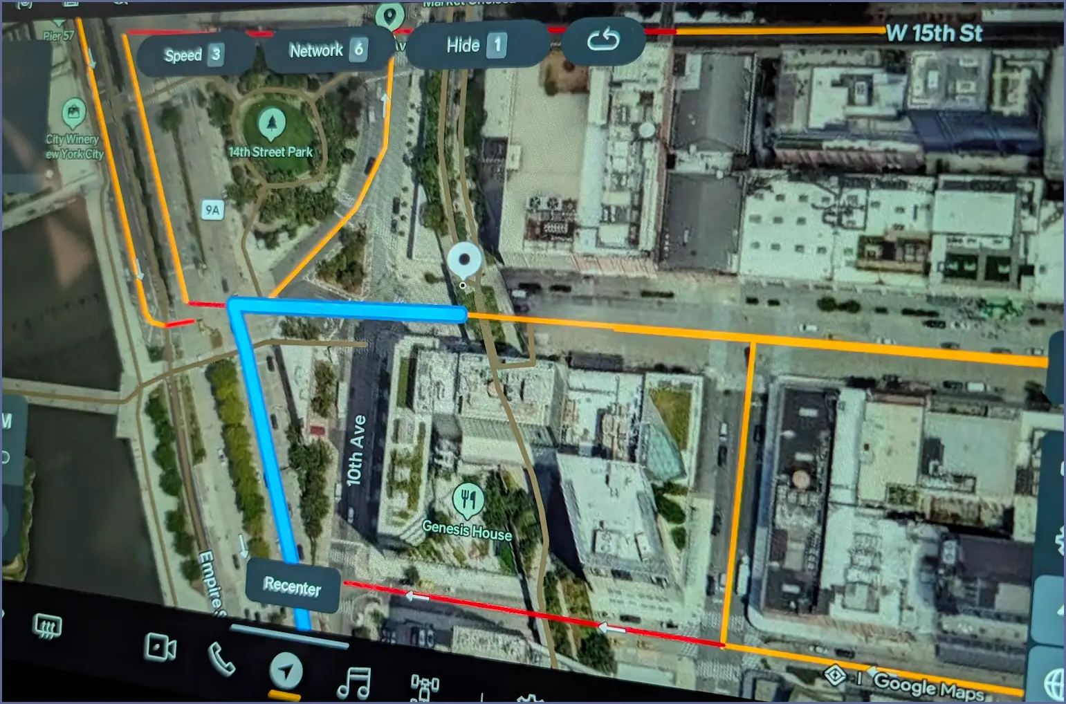
The Rivian's maps in dark mode, both the previous Mapbox version and the Google Maps replacement, are really dark, almost like there is a black opaque layer on top of the map. Everything else is nice and sharp, just like I like it, but the maps are almost impossible to follow, faded/washed out. If I change to the light mode, everything's fine with maps, but then everything everywhere is on a white background, which just isn't for me. It's not a brightness question either, even with brightness all the way up the map itself is still entirely too dark and washed out when in dark mode.
Interestingly this problem also exists in the Android app on the phone. If I go to that middle tab with my phone in dark mode, even with the brightness turned all the way up, the planning map is just as dark, almost unreadable. @azbill confirmed that he's seeing the same thing in the iPhone app's center tab and, of course, on his Rivian's center screen too.
Anyone else bothered by this? If so, please send detailed feedback in the app to help make the developers aware of the issue. I've spoken to service about this, but I'm not convinced they understand what I'm seeing. Maybe we can get some traction here.
UPDATE: Aug 2025: It's as if they took the Google Maps rendering where there is a satellite background, then text and roads overlaid on that, and then put a big translucent black screen over all of that. That's not dark mode, that's severely dimmed.
Thanks
[ I had posted something similar this in the large 2025.22 thread, but believe it deserves its own thread, especially since this isn't 2025.22 specific ]
I like dark mode. I use it on Android phones, I use it on Windows computers, and I use it on my AAOS Volvo XC90. Backgrounds are black (or dark), text is light, and everything is crisp and readable, even in bright sunlight. Unfortunately, that's not been my experience with Rivian.
The Rivian's maps in dark mode, both the previous Mapbox version and the Google Maps replacement, are really dark, almost like there is a black opaque layer on top of the map. Everything else is nice and sharp, just like I like it, but the maps are almost impossible to follow, faded/washed out. If I change to the light mode, everything's fine with maps, but then everything everywhere is on a white background, which just isn't for me. It's not a brightness question either, even with brightness all the way up the map itself is still entirely too dark and washed out when in dark mode.
Interestingly this problem also exists in the Android app on the phone. If I go to that middle tab with my phone in dark mode, even with the brightness turned all the way up, the planning map is just as dark, almost unreadable. @azbill confirmed that he's seeing the same thing in the iPhone app's center tab and, of course, on his Rivian's center screen too.
Anyone else bothered by this? If so, please send detailed feedback in the app to help make the developers aware of the issue. I've spoken to service about this, but I'm not convinced they understand what I'm seeing. Maybe we can get some traction here.
UPDATE: Aug 2025: It's as if they took the Google Maps rendering where there is a satellite background, then text and roads overlaid on that, and then put a big translucent black screen over all of that. That's not dark mode, that's severely dimmed.
Thanks
Sponsored
Last edited: