-
👉 R2 Orders ➡ Add Your R2 Orders / VIN / Delivery Info 📊
Sponsored
OP
OP
elektrode
Well-Known Member
- Thread starter
- #2
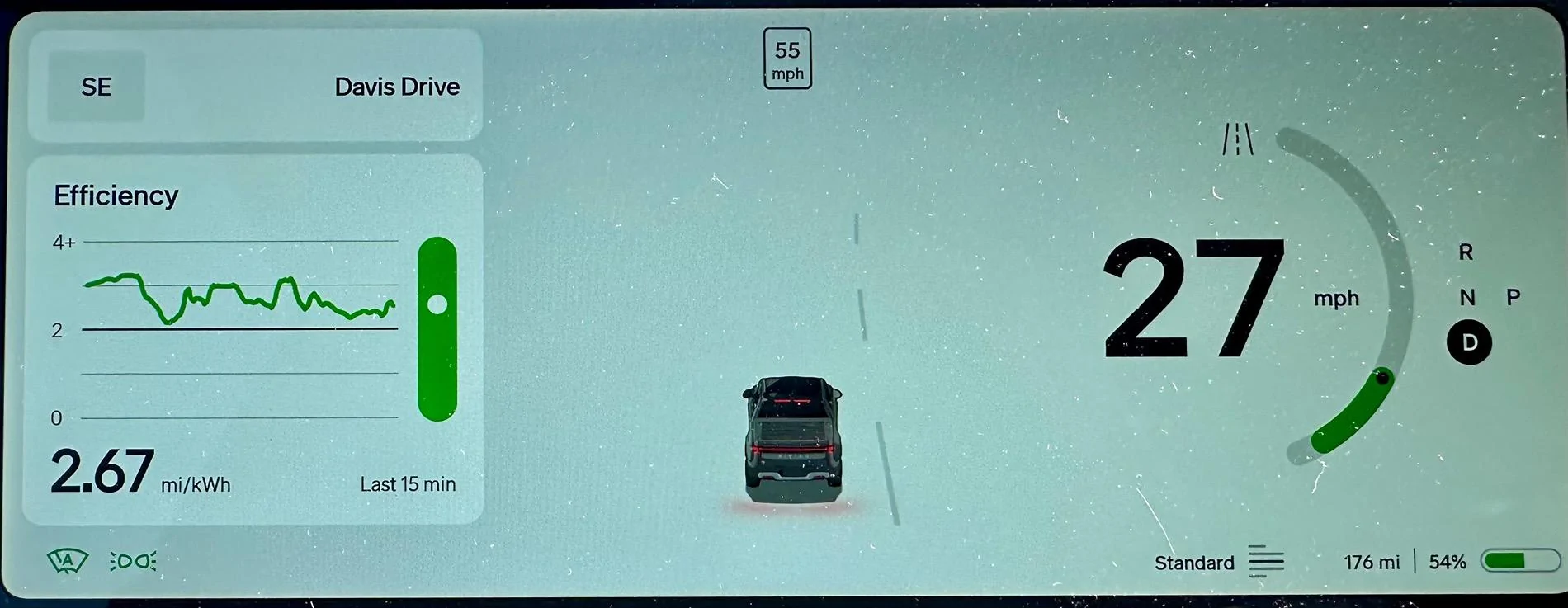
Questions:
- why is the bar graph so big?
- why is the bar graph that indicates a slower trend fatter and more prominent that the instantaneous power graph?
- if white dot equals good efficiency and black dot means bad efficiency, what does black dot on the power graph mean?
- why neon?
- how many colors of green does one need on one screen?
- why the thick magic marker lines?
- why does “last 15m” have a font that indicates it’s equally as important as my range and battery?
Hideous and distracting.
waitingonanr1s
Well-Known Member
I like it - much cleaner and easier to read IMO.
Noplacelikeloam
Well-Known Member
Will admit, I need some instructions here. ?
akc5247
Well-Known Member
Some of these display features should be made customizable to move between screens and or panels. It's great to see the efficiency but I would like the top of that to be for - say - clock or something else.
Sponsored
beatle
Well-Known Member
- Joined
- Jun 20, 2024
- Threads
- 17
- Messages
- 1,155
- Reaction score
- 1,570
- Location
- Springfield, VA
- Vehicles
- '23 R1T PDM Max, '97/'25 Miatas
- Occupation
- IT
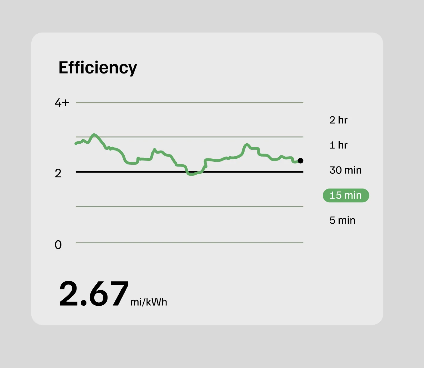
It's confusing because it's misleading. The baseline 2mi/kwh is well below what you need to get your vehicle's rated range, but since it's artificially low, it makes you think you're on track to make your truck's rated range if you stay above it. Consumption as a function of time is pretty useless since everything else is a function of distance. They should change the display to reflect mi/kwh over the past 15 miles,
The vertical bar on the right is actually worse now than before since it seems to trend green even if you're not making your truck's rated range. Before it was the only honest part of the display and would only show green if you were doing better than rated. Had they kept the data the same, I'd say the increased size and color would be a good thing.
The vertical bar on the right is actually worse now than before since it seems to trend green even if you're not making your truck's rated range. Before it was the only honest part of the display and would only show green if you were doing better than rated. Had they kept the data the same, I'd say the increased size and color would be a good thing.
DrBluey
Active Member
- First Name
- Ali
- Joined
- Jun 2, 2024
- Threads
- 3
- Messages
- 42
- Reaction score
- 83
- Location
- Ann Arbor, MI
- Vehicles
- 2023 R1S, 2023 Tesla MYP, 2019 Targa 4S
It’s like an iPad now. I really don’t want to drive an iPad. I liked the original two updates before.
Also, I’m surprised no one has asked for better navigation favorites and a way to organize them or have personal profiles for different drivers with their own work. My wife and I share the R1S and MYP and need our own profiles like the Tesla has.
Also, I’m surprised no one has asked for better navigation favorites and a way to organize them or have personal profiles for different drivers with their own work. My wife and I share the R1S and MYP and need our own profiles like the Tesla has.
Bongorivian
Well-Known Member
Jeez! Tough crowd. Somebody will always be unhappy about something. Nobody or no company can satisfy everybody. Rivian just carry on.i think it looks fine, other than absurdly large green bar on the right of the chart. it should be half as thick.
Sponsored
Bongorivian
Well-Known Member
When Steve Jobs and Apple introduced the iPhone and the virtual keyboard back then, many people cried foul and criticized it! Look where we are today …
goldburger
Well-Known Member
- Joined
- Feb 5, 2022
- Threads
- 18
- Messages
- 1,733
- Reaction score
- 2,041
- Location
- Los Angeles
- Vehicles
- 2022 R1T
I loved the minimal design on the drivers dash screen and my steering wheel blocks the top part of the screen anyway. The new graph screen is gigantic it’s so ugly there are way too many font size variations. It’s offensive to look at wish I could turn that side to blank now.
Mister Person
Well-Known Member
Mister Person
Well-Known Member
Here, I fixed it.

CANCERDOC
Well-Known Member
- First Name
- Eric
- Joined
- Oct 26, 2023
- Threads
- 14
- Messages
- 743
- Reaction score
- 1,162
- Location
- Southern California
- Vehicles
- 2024 R1S PDM
- Occupation
- Healthcare
The font is bigger and it’s easier to read. I like it. Don’t really need the bar above it. Doesn’t really serve a purpose but I guess maybe useful if you are traveling somewhere new.
Sponsored
Similar threads
- Replies
- 15
- Views
- 1,848
- Replies
- 39
- Views
- 4,159