Sponsored

Why the efficiency graph is way off vs real efficiency.

EVTrukHog

Well-Known Member
First Name
Matt
Joined
Aug 31, 2021
Threads
37
Messages
666
Reaction score
1,018
Location
USA
Vehicles
R1T, C6 Corvette, Ford Explorer
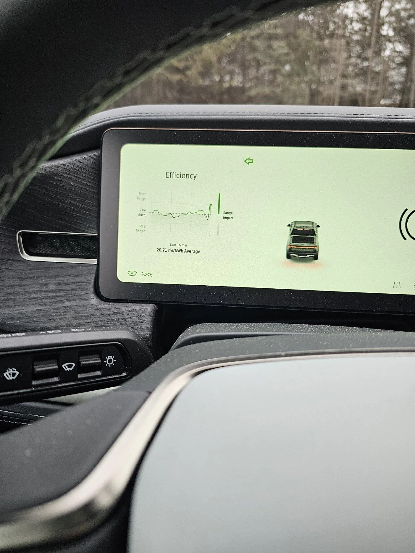
Many ICE vehicles have a mpg digital readout that shows instantaneous efficiency in real time… always thought the Rivian graph is mimicking that readout. It’s interesting but not terribly useful.

i do like to watch it on cold mornings to see how long it takes battery to warm up and efficiency to plateau to normal level.
Sponsored


VSG

Well-Known Member
Joined
Oct 3, 2022
Threads
4
Messages
3,214
Reaction score
6,009
Location
WA
Vehicles
R1T LE/RB/OC/20
A graph of instantaneous efficiency would be worthless because it would rapidly fluctuate between 0 (when stopped) and ∞ (when using regenerative braking). The result would look like scribbling and you wouldn't be able to easily tell what your overall efficiency was. A running average like Rivian uses is a great way to smooth out those frequent extreme fluctuations and give a good overall picture. This is essentially a low-pass filter on the data that makes it usable for the driver.

While the graph shows 15 minutes of history, and the number below the graph shows the 15 minute average, the right-most data point (the green circle) shows the current average (not instantaneous) efficiency. I don't know what period this point is averaged over. From my observations I don't think it's as long as 15 minutes, but it has to be long enough to greatly reduce the noise and the clutter you would see if it were an instantaneous number.

Over the past 20k miles in my R1T, I have found this graph to be useful while driving - which is what it's meant for. I don't see how the trip meter efficiency number on the gauge view can be very informative for use while driving, because it is an average over the trip and therefore the meaning become less and less relevant to your current efficiency as your trip progresses.
 

NCRivian

Active Member
First Name
Joe
Joined
Apr 23, 2023
Threads
1
Messages
31
Reaction score
43
Location
Snow Camp, NC
Vehicles
2021 Chevy suburban. 2023 R1T
Occupation
Plumber
My question is why is your front tire pressure way lower than the rear?
 

SSteveEV

Well-Known Member
First Name
Spencer
Joined
Nov 3, 2022
Threads
7
Messages
1,319
Reaction score
1,795
Location
Michigan
Vehicles
R1T, etc
Clubs
 
I think the first 15 min includes some of the vampire drain from the period it has been sitting. Haven't fully chased that down but try resetting the trip counter 15 min into a 30 min drive and j bet they are pretty equal.
 

BG_ATX

Well-Known Member
Joined
Dec 28, 2021
Threads
2
Messages
48
Reaction score
43
Location
Austin
Vehicles
Cadillac CTS
Then there's the average of the last 15 mins of this (the entire current graph) calculated with the number at the bottom. This also seems to be pretty accurate in my experience. You can watch the efficiency line on the graph go down and up based on going up a hill and down the other side, or up when going 55 then way down when upping to 75 etc.
I find the prior 15-minute graph very helpful and accurate. Massive swings based off how heavy I am with the pedal, incline/decline and regen usage. Seems to be just a slight delay on the right side of the chart, maybe 5 seconds in my experience. My driving actions are represented in the graph, as are my wife’s inefficient driving practices when I drive after her. Graph don’t lie.
 

Sponsored

Craigins

Well-Known Member
Joined
Jun 10, 2021
Threads
2
Messages
1,571
Reaction score
2,397
Location
Chicago Suburbs
Vehicles
Rivian R1T
Occupation
Software engineer
Clubs
 
So what I think the efficiency meter does is average the last 15 minutes and THEN the bottom number is actually the average
of all these data points! So it is like the average of the trailing 15 minute data points....quite a lag!
From watching the graph while driving, this is my conclusion as well. Doesn't make any sense really, not sure why they went with it.

Not a very useful number.
 
OP
OP

fbitz777

Well-Known Member
First Name
francois
Joined
Oct 4, 2021
Threads
12
Messages
144
Reaction score
115
Location
16066
Vehicles
R1T 2017MX; 2022 Ioniq5 (2)
From watching the graph while driving, this is my conclusion as well. Doesn't make any sense really, not sure why they went with it.

Not a very useful number.
If they did not do this that graph would pretty bad if you sit at stop light (zero mi/kwh) or after vampire drain in the first minutes in the morning. I think it is a smoothing function.
 

Craigins

Well-Known Member
Joined
Jun 10, 2021
Threads
2
Messages
1,571
Reaction score
2,397
Location
Chicago Suburbs
Vehicles
Rivian R1T
Occupation
Software engineer
Clubs
 
If they did not do this that graph would pretty bad if you sit at stop light (zero mi/kwh) or after vampire drain in the first minutes in the morning. I think it is a smoothing function.
Typically the efficiency graphs that I see, in the prius for example, are 15 min graph, each data point is an average of the previous minute. Then the number at the bottom is the average over 15 minutes., not the average of averages.
 

ebarke

Well-Known Member
First Name
Eric
Joined
Sep 10, 2022
Threads
3
Messages
152
Reaction score
127
Location
MN
Vehicles
why does this matter?
Occupation
software engineer
Clubs
 
Rivian R1T R1S Why the efficiency graph is way off vs  real efficiency. 20240103_152653

I captured this quickly...it did at first show something like 27.x mi/kwh, but I couldn't get my phone out quick enough to capture it. I don't really care for this either, would prefer something like in the Tesla where it has the last 15 or 30 miles, not minutes. Would also love to see current trip meters that automatically get reset with each drive.
 

BCondrey

Well-Known Member
First Name
Barry
Joined
Dec 12, 2021
Threads
0
Messages
695
Reaction score
696
Location
Richmond, VA
Vehicles
R1T
Occupation
IT
I'd like to know if the "dot" on the efficiency screen is for the past minute, or the average of the last 15 minutes. I try to not obsess over it, and I've started using the trip meter more to check the efficiency.
 

Sponsored

dgennetten

Well-Known Member
First Name
Douglas
Joined
May 4, 2023
Threads
11
Messages
151
Reaction score
204
Location
Fort Collins
Vehicles
R1S
Occupation
Retired Electrical Engineer
Clubs
 
I think the primary "flaw" in the efficiency meter is the x-axis variable. It should be distance, not time. And it should go inactive when your not moving. The area under the curve exaggerates the benefit of low speed efficiency compared to high.
 
OP
OP

fbitz777

Well-Known Member
First Name
francois
Joined
Oct 4, 2021
Threads
12
Messages
144
Reaction score
115
Location
16066
Vehicles
R1T 2017MX; 2022 Ioniq5 (2)
I'd like to know if the "dot" on the efficiency screen is for the past minute, or the average of the last 15 minutes. I try to not obsess over it, and I've started using the trip meter more to check the efficiency.
agreed
except trip/odo meters should be on center display
 

SRO

Well-Known Member
First Name
Steve
Joined
Mar 21, 2023
Threads
3
Messages
299
Reaction score
142
Location
Carson City nv
Vehicles
R1T
Occupation
retired
A graph of instantaneous efficiency would be worthless because it would rapidly fluctuate between 0 (when stopped) and ∞ (when using regenerative braking). The result would look like scribbling and you wouldn't be able to easily tell what your overall efficiency was. A running average like Rivian uses is a great way to smooth out those frequent extreme fluctuations and give a good overall picture. This is essentially a low-pass filter on the data that makes it usable for the driver.

While the graph shows 15 minutes of history, and the number below the graph shows the 15 minute average, the right-most data point (the green circle) shows the current average (not instantaneous) efficiency. I don't know what period this point is averaged over. From my observations I don't think it's as long as 15 minutes, but it has to be long enough to greatly reduce the noise and the clutter you would see if it were an instantaneous number.

Over the past 20k miles in my R1T, I have found this graph to be useful while driving - which is what it's meant for. I don't see how the trip meter efficiency number on the gauge view can be very informative for use while driving, because it is an average over the trip and therefore the meaning become less and less relevant to your current efficiency as your trip progresses.
My 2017 Bolt had a real time digital read out. It was great. It had different colors for Kw used or generated and had fairly big numbers on the driver display. I assume it is a GM thing. The best charge rate I got was over 50 Kw decelerating downhill. This has been one of my OTA suggestions for almost two years.
 

kurtlikevonnegut

Well-Known Member
Joined
Sep 1, 2021
Threads
27
Messages
2,715
Reaction score
7,525
Location
SC/TX
Vehicles
2023 R1S DM, Honda Odyssey
Clubs
 
The right most point (green area in your pic) of the graph is the current efficiency. That seems to be pretty accurate in my experience. Then there's the average of the last 15 mins of this (the entire current graph) calculated with the number at the bottom. This also seems to be pretty accurate in my experience. You can watch the efficiency line on the graph go down and up based on going up a hill and down the other side, or up when going 55 then way down when upping to 75 etc.

I do agree it would be nice to have even more data like actual current power consumption (even better if it was broken down into motors, heat/ac, and everything else..)

And yeah I still want a regular odometer and trip meter option on the driver display.
I'm hoping that they move towards more customization with the "tiles" on the data display, being able to pick from a wider range of data points and effectively create your own dashboard. I'd also really like to see them give the option of having Trip A automatically reset after the truck is idle for a certain amount of time. I had an Audi that did this (Trip A reset after 2 hours idle, Trip B was manual reset only) and it was a great feature. They don't necessarily have to make it standard, but having it as an option would be great for those like me that want to be able to see drive efficiency but don't always remember to hit reset before leaving.
 

zefram47

Well-Known Member
First Name
Aaron
Joined
Feb 6, 2022
Threads
18
Messages
2,750
Reaction score
4,513
Location
Denver, CO
Vehicles
Rivian R1T, Alfa Romeo 4C
Occupation
Software Engineer
FWIW, on my commute this morning the graph matched the trip meter almost exactly. Commute was 20 min, about 14 miles and showed 2.6 mi/kWh on both the graph (had been above the 2 line for everything save for the first mile) and the trip meter.
Sponsored


Top